Asia Population Database Documentation
One objective of improving the boundary and population
data for Asia as described in the previous sections was to develop
a "second-generation" population distribution surface.
The global demography project at NCGIA produced a gridded data
set for the whole world that was constructed using a smoothing
technique that has the property of preserving population totals
within each administrative unit. The raster surfaces based on
the approach outlined in the following section were constructed
using an alternative interpolation method. This method
preserves population totals as well and incorporates significant
additional information on settlements, transport infrastructure
and other features important in determining population distribution.
The conversion of population data from a vector or polygon representation
to raster format has the added advantage that the data can be
more easily combined with many spatially referenced physical data
sets which are most often stored in a gridded format. This facilitates
the use of these data in research and policy analysis and will
hopefully contribute towards an increasingly integrated approach
to the study of problems related to population, the environment,
economics and culture as advocated, among others, by Joel Cohen
in his recent book (Cohen 1995).
The development of the raster grid surfaces was conducted
in collaboration with Hy Dao of the University of Geneva and UNEP/GRID
Geneva. Dominique Del Pietro (UNEP/GRID Geneva) provided valuable
support in developing the base data layers. The approach outlined
here as well as alternative approaches to spatial population modeling
are discussed in more detail in Deichmann (1996).
The basic assumption upon which the construction
of population distribution raster grids for Asia is based is that
population densities are strongly correlated with accessibility.
Accessibility is most generally defined as the relative opportunity
of interaction and contact. These opportunities are the largest
where people are concentrated and transport infrastructure is
well developed. Within any given area, we therefore expect a
larger share of the known total population to live in more accessible
regions compared to areas that are less well connected to major
urban centers.
Summary description of the method
The method for the development of population raster
grids consists of the following steps. The most important input
into the model is the transportation network consisting of roads,
railroads and navigable rivers. The second main component is
information on urban centers. Data on the location and size of
as many towns and cities as can be identified are collected, and
these settlements are linked to the transport network. This information
is then used to compute a very simple measure of accessibility
for each node in the network. The measure is the so-called population
potential which is the sum of the population
of towns in the vicinity of the current node weighted by a
function of distance, whereby network distances rather
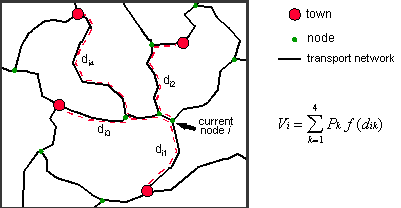
than straight-line distances are used. The following figure illustrates
the computation of the accessibility index for a single node.
The computed accessibility estimates for each node
are subsequently interpolated onto a regular raster surface.
Raster data on inland water bodies (lakes and glaciers), protected
areas and altitude are then used to adjust the accessibility surface.
Finally, the population totals estimated for each administrative
unit (as described in the first part of this documentation) are
distributed in proportion to the accessibility index measures
estimated for each grid cell. The resulting population counts
in each pixel can then be converted to densities for further analysis
and mapping. Each of these steps will now be described in more
detail.
Construction of the transportation network
There are few data sources that provide consistent,
geographically referenced base data layers for large areas such
as an entire continent. The transportation infrastructure data
for this project was constructed using the following data sets:
major roads from the World Boundary Databank II (WBDII), minor
roads from the Digital Chart of the World (DCW), railroads as
well as major navigable waterways from WBDII. WBDII originated
at the U.S. Central Intelligence Agency and a cleaned-up Arc/Info
version is available from the Environmental Systems Research Institute
(ESRI). The nominal scale of WBDII is 1:3 million. The scale
of the DCW base maps (the Operational Navigational Charts) is
1:1 million. Since we also used DCW for the international boundaries
in the administrative unit data layers and since WBDII and DCW
appear to share common ancestors, a good fit exists between the
individual data layers.
A brief technical discussion is now required to clarify
the arec-node structure of the transportation data.
After merging the individual
components of the transport network into one data layer there
are still no connections between the individual components (e.g.,
railroads and rivers). To allow the model to choose the most
efficient means of transport at any point in the network, the
intersections between the individual transport layers need to
be found. This is a standard GIS operation that results in a
well-structured data layer of line segments (or links)
representing roads, railroads or rivers. These are connected by
nodes which are intersections of two or more line segments
of different or similar types. Nodes, of course also represent
the end of an unconnected line segment.
The program used for calculating accessibility produces
an estimate for each node in the network. The problem in an application
where the network is sparse in many regions is that no values
are derived for areas that are not connected to the network.
In the Asia application this applies to large areas since WBDII
and DCW only include fairly important transport features that
are relevant at a cartographic scale of 1:1 or 1:3 million. One
solution is to calculate the accessibility index for the center
of each grid cell of the subsequently generated output raster.
From each grid cell, the distance to the closest transport feature
could be calculated and added to the network distances to the
closest towns. This approach was used by Geertman and van Eck
(1995). However, this approach is not realistic where the closest
access point to the transport network is at a location which is
actually far away from urban centers. Another network
access location that may be further away from the grid cell initially,
but better connected to major towns. To evaluate different
options of network access for each grid cell would be impractical,
and we therefore chose a different approach. In areas where the
transport network is sparse, auxiliary line segments were added
which essentially represent "feeder roads".; Essentially,
this means that people who may be living in these remote
areas are using trails or tracks to get to the main transport
network first and then continue their travels to the nearest city
along the fastest routes. The algorithm automatically determines
which network access is optimal in reducing overall travel times.
It would be straightforward to use simple network
distance for the calculation of accessibility. However, different
line segments representing various transportation modes are associated
with quite different travel speeds. For example, a kilometer
travel on a paved road will take much less time than the same
distance on a river. Instead of simple distance, we therefore
used cumulative travel time as the weight in the accessibility
calculation. Each line segment in the resulting complete transportation
network is associated with an estimate of average travel speed
that is thought to be possible. Major, surfaced roads from WBDII
are assumed to allow for a travel time of 90km/h, minor roads
were assigned a speed of 60km/h, 50km/h are used for railroads,
20km/h for navigable rivers, and 5km/h for the auxiliary network
access routes. For each line segment, we calculated the real-world
distance in kilometers.
However, all data layers are referenced
in geographic (latitude/longitude) coordinates and no map projection
is able to represent real-world distances in all directions with
sufficient accuracy for large regions. We therefore calculated
the correct length of each line segment as the sum of the great-circle
distances of all vertices that make up the line segment between
two nodes. The time it takes to traverse each section of the
transport network is then simply its length in km divided by the
travel speed associated with the specific type of transport infrastructure.
Setting up urban data
The accessibility index is the sum of the population
totals of the towns in the vicinity of the current location weighted
by the network travel time ("distance") to those towns.
Data on the location and size of urban centers were collected
from a range of sources. Based on the World Cities Population
Database developed by Birkbeck College and distributed by UNEP/GRID,
a considerable number of additional town populations were identified
from UN publications, gazetteers and yearbooks, and national census
reports. The location of towns was determined from the gazetteer
in the Times Atlas or from published maps. Altogether, 2308 cities
were identified from all sources (of these, about 200 are in the
European part of Russia). Where population figures for the city
were available for more than one time period (e.g., for the last
two censuses), an estimate for 1995 was derived using the same
approach chosen for the administrative unit data (i.e., a simple
trend forecast). Where only one figure was available, the corresponding
national-level average annual urban growth rate published in the
UN World Urbanization Prospects (1994 revision, UN Population
Division) was used.
During the modeling, it became clear that despite
the considerable effort that went into the development of the
urban database, the available detail was still insufficient in
all but a few countries. Generally, population figures are published
only for the largest cities in a country - i.e., those with population
totals larger than 100,000. We therefore added additional towns
whose locations were determined from available maps and atlases
and whose population figures were estimated using a simple heuristic
based on the rank-size rule. Although this rule helps us to determine
how many towns with a given population total might exist, there
is no way of knowing which town should be associated with which population
figure. We therefore assigned the population totals heuristically
keeping patterns suggested by central place theory in mind. For
example, major regional centers should be surrounded by several
minor centers with a correspondingly lower population.
This procedure is clearly subject to significant
judgmental error. Although the errors introduced cannot be
determined, we expect that the added benefit of using additional
towns in the accessibility calculation far outweighs the potential
error introduced in the resulting accessibility index. In fact,
since most of these auxiliary towns have relatively low population
totals (since the major towns are already accounted for), the
error introduced by this heuristic estimation procedure may well
be within the range of the ordinarily expected error that is present
in published urban population figures. Still, in a future modeling
effort a more formal procedure could be developed that combines
the empirical evidence that forms the basis of the rank-size rule
and central place theory to provide a more replicable image of
the urban hierarchy in a country.
Towns need to be connected
to the transport network to enable the accessibility calculation
algorithm to find the closest towns for each node in the network.
The settlements were therefore simply assigned to the network
node closest to their current location.
Run accessibility calculation
For the actual accessibility calculation we used
a stand-alone program written in the C programming language.
This program reads the entire network definition which consists
of (a) the identifiers for each node and the population size of
the town that corresponds to the node - zero in most cases, indicating
that no town is located at the node-, and (b) the identifiers
of the two nodes that define each arc and the travel time required
to traverse the arc.
A further option of the program that allows for considering
the direction of travel along a line segment was not used. This
implies that there are no "one-way streets" and that
travel time is the same regardless of which way one travels.
This assumption could be relaxed since, for example, travel speeds
are lower up-river than down-river, but the added gain in realism
will not compensate for the additional effort required in defining
these details. Also, no further assumptions are made about modal
choice. In moving through the network, an imaginary traveler
may change his or her means of transport at will. This is unrealistic
since a switch, say from road travel to a train and on to a boat,
are all associated with delays. In order to keep the model simple
(and run-times manageable) we did not introduce a penalty for
switching the transport mode. A modification relevant to an application
in a regional setting was made, however. For any line segment
that crosses an international boundary, the travel time was increased
by 20 minutes reflecting delays in border crossings. This added
travel time could be varied depending on the relations between
two neighboring countries. This would either require subjective
judgment or very detailed information on the permeability of international
borders.
For each node in the network, the program now finds
the network path to each of a specified number of towns that results
in the lowest overall travel time. In the initial program specification,
all towns reached within a user-defined specified travel time
(e.g., 5 hours) were determined. However, in areas where towns
are sparsely distributed and the number of nodes and line segments
is large, this resulted in unacceptably long run-times. For China,
with about 80,000 nodes, the program was estimated to require
about three days. Instead, we modified the program to find the
closest four towns or less if fewer than four towns were accessible
within a more generous threshold travel time (the calculations
for China still took 24 hours). This also makes the index somewhat
more comparable across large areas, since the previous specification
resulted in the accessibility index for some densely urbanized
areas to be based on fifty or more towns, while other regions
would only contain two or three.
For the shortest path calculation the program uses
the standard Dijkstra algorithm. The program section used for
this search consists of a modified version of a fast implementation
of this algorithm developed by Tom Cova, a transportation GIS
specialist at NCGIA. The Dijkstra algorithm evaluates the network
structure around the current location starting from the center
and reaching further and further out. For applications in which
only one origin-destination pair is of interest, this is inefficient
and various modifications have been suggested to speed up the
search. In this application, in contrast, the interest is in
finding the shortest path to all towns within the vicinity and
the modified algorithm "collects" towns as it ventures
out from the originating node. Once four towns have been found
and the program has determined that all additional connected line
segments will not lead to a town that is closer than those already
found, the search is terminated and the town populations and travel
times are passed to a program section that calculates the accessibility
measure.
This measure is the sum of the town populations weighted
by a negative exponential function of travel time ("distance").
I.e.,
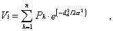
where Vi is the accessibility estimate
for node i, Pk is the population of town
k, dikis the travel time/distance
between node i and town k, and is the distance
to the point of inflection in the distance decay function. This
parameter was set to one hour in this case which means that the
influence of a town one hour away decreases to about 60 percent,
and a town two hours away will only contribute 14 percent of its
total population to the accessibility index. Rather than using
total urban population, we applied a square root transformation
to the population figures, implying that each additional person
living in a city has an increasingly lower influence. This transformation
avoids an exaggerated influence of very large mega-cities while
being less of an equalizer than the more common log-transformation.
Interpolation
The accessibility index that is available for each
of the nodes in the network needs to be converted into a regular
raster grid. We used a simple inverse distance interpolation
procedure that resulted in a relatively smooth surface. A problem
with this technique is that interpolated values will not fall
outside the range of the values recorded at the neighboring node
locations. In analogy to interpolating elevation data: if recorded
values are available only for locations on the slope of a mountain
but not at the peak, the interpolated value for the summit location
will be underestimated. Conversely in our application, if values
are recorded only for network nodes, but not for areas that are
remote from transport routes (e.g., deserts), then using the neighboring
node values for interpolation will overestimate the accessibility
for the remote location.
Yet, experiments with other interpolation procedures
did not result in satisfactory results. Thin plate spline interpolation
may be more appealing theoretically since it would allow values
at interpolated locations to fall below (or above) those that
are recorded at neighboring locations, if the overall tension surface
suggests a corresponding trend. However, the values estimated
for some locations were clearly out of the range of what would
be reasonable. Given the large number of nodes introduced in
remote areas by adding the auxiliary access routes, we consider
the simple inverse distance interpolation to be sufficiently accurate.
Adjustment of the accessibility measure
Three additional data sets were used to adjust the
resulting accessibility index grid: inland water bodies, protected
areas, and elevation. Lake areas were masked and grid cells that
fell onto a glacier were assigned an accessibility value of zero.
This information was derived from the DCW drainage network data
layer (DNNET).
GIS data layers on protected areas were obtained
from the World Conservation Monitoring Center (WCMC). Unfortunately,
little information about each protected area was available besides
its name, such that it was impossible to relate, for example,
protection status to an estimate of how much the areas may still
be used and inhabited by people. We reduced the accessibility
index for grid cells that fell into national parks to 20 percent
of the original value and for areas falling into forest reserves
to 50 percent. These values are subjectively determined to allow
for the fact that the protection of protected areas is not always
perfect. Since most of these parks are in remote region, the
change in predicted population densities that would be introduced
by varying the adjustment factors should be small.
Finally, we reduced the accessibility index in areas
above a specified elevation threshold. Elevation represents vertical
distance which is assumed to increase travel time.
For example, for most regions
of Asia, we adjusted the grid cells above 2000m using the following
simple formula: accessibility = (accessibility
/ ((actual elevation - 1000) / 1000). Thus, for
a grid cell at 2500 meters, the accessibility value is divided
by 1.5. For North-East Asia - i.e., mid-latitude areas, the threshold
was lowered to 1500m and the calculation adjusted correspondingly.
The assumption is that an additional constant gain in elevation
will matter progressively less such that the largest marginal
adjustments are made in the relatively lower elevations. Alternative
assumptions would obviously be possible, and the elevation threshold
could be continuously varied as a function of latitude. For instance,
close to the equator, areas at 2000m elevation may be considered
prime agricultural regions, while in mid- and higher latitudes,
little economic activity is possible at this altitude. Again,
we consider the resulting population density surfaces to be relatively
insensitive to reasonable alternative specifications. A digital
elevation model (DEM) for Asia was available from UNEP/GRID Sioux
Falls which is involved in the production of a complete global
DEM at approximately 1km resolution in collaboration with EROS
Data Center. Unfortunately elevation data were not yet available
for the mountain ranges of Irian Jaya and Papua New Guinea.
Distribution of population
The distribution of the population total available
for each administrative unit over the grid cells that fall into
that unit is straightforward. The accessibility values estimated
for each grid cell serve as weights to distribute population proportionately.
First the grid cells in the accessibility index are summed within
each district. Each value is divided by the corresponding district
sum such that the resulting weights sum to one within each administrative
unit. Multiplying each cell value by the total population yields
the estimated number of people residing in each grid cell. The
standardization of the accessibility index implies that the absolute
magnitudes of the predicted access values are unimportant - only
the variation within the administrative unit determines population
densities within each district.
Again, we have to take account of the fact that all
GIS data layers and raster grids are referenced in latitude/longitude
coordinates. This means that grid cells further away from the
equator represent a smaller real-world area than grid
cells further away. For example, a 2.5 minute grid cell has a
real-world area of 10.8 square km at 60 degrees latitude,
of 18.6 square km at 30 degrees and of 21.4 square
km at the equator. We therefore weighted the accessibility index
value for each grid cell by the actual area of the grid cell before
standardizing within each district.
Because only the relative magnitudes of the accessibility
index are important in distributing total population, and since
most administrative units are fairly small, the error introduced
by the distortions of the geographic coordinate system will usually be
insignificant. However, in West Asia, for example, where the
available resolution of the administrative units is fairly low,
the difference in the actual areas of grid cells located in the
North of the districts compared to those in the South was relatively
large. The resulting difference in predicted population densities
using undadjusted and adjusted accessibility values reached up
to eight people per square km. The errors would be even larger
in higher latitudes with low resolution administrative units (e.g.,
Siberia).
Calculate densities and create cartographic output
From the grid cells of total population, population
density images are created by dividing the population counts
estimated for each grid cell by the real-world area in square
km of that cell. For quick visualization of the results, these
population density surfaces were converted into a TIFF (Tagged
Image Format File) image by squeezing the density values into
a 0-255 range using an non-linear transformation; that means
relatively more colors are used to represent the same amount of
density variation at low densities than at high densities. These
images are meant purely for quick visualization, since the exact
estimated densities are available in the original images.
We used version 7 of the workstation version of Arc/Info
for compilation of input data and most of the modeling. The GRID
raster module of Arc/Info provides an excellent environment for
this type of work. The raster modeling was performed at a resolution
of 2.5 minutes which corresponds to about five km at the equator.
We do not claim that 2.5 is the optimal grid size for this application.
In fact, there is no single optimal grid size, since the available
resolution of the input data and thus the appropriate cell size
is highly variable. For some countries, a grid size of about
five km is justifiable (e.g., for Vietnam or Bangladesh), while
for others - for example, in Western Asia, a twenty minute grid
square would make more sense. Data structures that allow for
variable grid sizes do exist but implementation would be more
complex. Instead we rely on the user to evaluate the boundary
data to judge for himself or herself whether a particular application
is meaningful at this resolution for a given area.
Instead of working with very large and possibly unmanageable
data sets, we partitioned the Asian continent into eight blocks
(no political interpretation intentioned!). As block boundaries
we used whole latitude/longitudes only, such that no resampling
was necessary in merging the individual output grids to produce
regional and continental data sets. The transport and settlements
data layers for each block included a one degree wide buffer containing
information for neighboring areas. This avoids artifacts in the
computation of accessibility values for nodes that are located
close to the block boundaries.
The output from this modeling effort is available
for each of the standard UN regions for Asia - Western Asia,
South-Central Asia, South-East Asia, and East Asia (see summary
table in the appendix) - as well as for the Asian part of Russia
(east of 60 degrees East). Three products have been assembled:
- a raster grid of total estimated population within
each grid cell. This is a floating point raster image in which
the total summed population for each district equals the estimated
total in the administrative unit coverages exactly. For those
who find the concept of fractional population disconcerting,
the floating point values can easily be converted into a rounded
integer grid by using the GRID command: outpop = int(inpop
+ 0.5). Of course, the precision of the exact population
values implies a degree of accuracy
in the estimates that is by no means justified. We simply continue
to carry the full precision of the estimated figures through all
processing steps, relying on the end user to present the results
of further analysis with appropriately fewer significant digits.
- a raster grid of estimated population densities
(people per square km). Both, the total population and the density
grid are in GRID ASCII format. This format is easily imported
into Arc/Info and due to its simple structure can be converted
into other formats fairly easily.
- a TIFF image of population density with a corresponding
header file (.tfw) which allows for displaying the image using
standard graphics packages (e.g., xv, or Paintshop) or as a background
in desktop mapping packages.
File names are as follows:
regionPOP.ASC: total population grid
regionPOPD.ASC: population density grid
regionPOPD.TIF: population density TIFF image
(also requires regionPOPD.TFW),
where region is WAS for Western Asia,
SCAS for South-Central Asia, SEAS for South-East
Asia, EAS for East Asia, and RUS for Russia.
Accessibility and population density
The modeling strategy rests on the assumption that
accessibility is directly related to population distribution.
Conceptually, this makes intuitive sense since people tend to
live in or around major urban centers and close to transport infrastructure;
or, conversely, roads and railroads tend to be built where people
live. Unfortunately, empirical estimates of the influence of
accessibility at a small cartographic scale are rare. One of
the few exceptions is the West Africa Long Term Perspective Study
(WALTPS; see Ninnin XX). A major component of this study was
an analysis of market systems, agricultural production and population
densities in West Africa. Based on detailed information on each
of these factors, a so-called "market-tension" surface
was created that summarizes the influence that markets for agricultural
products (i.e., urban consumers) have on producers in rural areas subject
to production constraints and transport infrastructure. The surface,
which is estimated using a fairly complex spatial equilibrium
model, was shown to be highly correlated with population densities.
An accessibility surface for West Africa that was constructed using a
very similar approach as the one used for the population modeling
in Asia, in turn explained about 80% of the variation in the much
more complex market tension surface.
For the Asian population surfaces, we can obtain
an indication of the relationship between accessibility and population
densities at the district level. As an example, we computed the
mean accessibility for each of the 465 districts in India and
plotted these values against the actual population density of
each district. The following figure shows the strong relationship
between the logarithms of the two indicators quite well. Predicting
population densities as a function of mean accessibility in a
simple bivariate (log-log) regression yields an R square value of 0.6 and
a t-value for the independent variable of 26. The residual plot
(not shown) indicates that, not surprisingly, the simple model
underpredicts very high population densities which are located
in the top right corner of the plot.

At this scale, differences are, of course, difficult
to detect visually, although it appears that major inter-state
transport routes have a more explicit impact on the image to the
right, which, on the whole, also looks smoother.
A more precise indication is given by comparing the
actual population figures for each district with the predicted
population. These are by definition identical for the left image
since the method is pycnophylactic (or mass-preserving).
For the image derived using state-level population totals, the
mean absolute percentage error (MAPE) is 43.9. This appears to
be a rather large value even considering the fact that the states
are unusually large in area and population. Yet, the MAPE, like
every mean value, hides a significant amount of interesting variation.
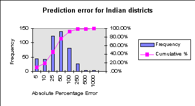
The next figure shows a histogram of the individual errors for
the 464 districts (Delhi was omitted since it is a state consisting
of only one district). Approximately half of all districts have
an absolute percentage error smaller than 25%, and 80% of the
errors are smaller than 50%. Less encouragingly, seven of the
districts have errors larger than 250%, and three are larger than
500% with the highest value just under 1000%. Omitting the ten
highest errors, the MAPE drops to 35.6.
Such unusually high outliers warrant further attention.
One hypothesis may be that the magnitude of the error is related
to population densities. Large errors may occur, for example,
where the model underpredicts the high densities in and around
an urban agglomeration. The next figure shows that this is not
the case.
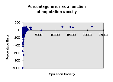
Here the signed percentage error, is plotted against
population densities. It becomes clear that the high population
density districts, while associated with fairly large underprediction
of 50-100%, do not correspond to the highest errors. On the contrary, the outliers
on the error scale originate in low density areas where relatively
small deviations in terms of absolute population figures translate
into very large percentage error. Of the ten districts with the
highest errors, eight are located in the North-Western mountains
(Jammu and Kashmir) or in the remote East of the country (Manipur
and Assam). Here, the terrain is the dominant determinant of
population distribution since large areas of these districts are
uninhabitable.
As emphasized before, we do not want to put too much
emphasis on these results. Population numbers and the areas of
Indian states are very large, and errors at such aggregate levels
are not necessarily good indicators of what we could expect at
more disaggregate levels. The preceding discussion was solely
meant to strengthen awareness of the limitations of any population
modeling effort and to outline possible avenues for more rigorous
error and sensitivity analysis.
Additional sources of error
Sources of error are, of course, numerous. Apart
from the uncertainty associated with the population estimates
and boundary data which have been discussed before, there are
also quality problems with the transportation network. Most importantly,
both, the WBDII and DCW roads layers are likely to be out of date.
More seriously, the road quality indicators are
of limited accuracy. Short of engaging in a major data development
project, which was far beyond the scope of this modest project,
there is unfortunately little we can do about these data limitations.
Urban areas are not treated explicitly in the modeling.
This is perhaps the single biggest limitation of the model.
In principle it should be possible to assign urban figures to
corresponding grid cells first, so that only the rural population
needs to be distributed according to the accessibility surface.
However, the quality of the urban population totals was judged
to be very low and we decided to leave the determination of urban
densities to the model. That means the accessibility values in
or close to urban centers are assumed to be high enough that an
approximately corresponding number of people will be distributed
to the relevant grid cells. In general, urban densities are unlikely
to be predicted with great accuracy in this way except in
cases, where a large town is represented by its own administrative
unit. Thus we expect urban densities to be generally underpredicted,
while rural densities in the vicinities of major towns are likely
to be overpredicted. The example presented earlier for India
supports this suspicion. There is no doubt that more accurate
information on settlements could significantly improve the model
output. As usual, we need more and better data.
In using the population grids in modeling, an analyst
should be aware of what went into the models. Bias is easily
introduced if the focus of the analysis is on one of the factors
used in the model. This is particularly important when elevation,
roads, towns, or protected areas data are used in combination
with these population surfaces. Climatic information, while potentially
relevant, was consciously excluded from the model to reduce bias
in studies that link population with agroecological factors.
Finally, there is no doubt that the most important
determinant of accuracy of the resulting surfaces is the resolution
of the administrative boundary data. No modification in the modeling
approach could match the additional benefit gained by incorporating
higher resolution source data. It is therefore very important
that the collection of these data is continued and that administrative
boundary and census data are shared among national and international
institutions for the benefit of everyone who requires timely and
accurate data on human population distribution.
[ Next Section || Back to Beginning ||
GRID-Sioux Falls ]


|